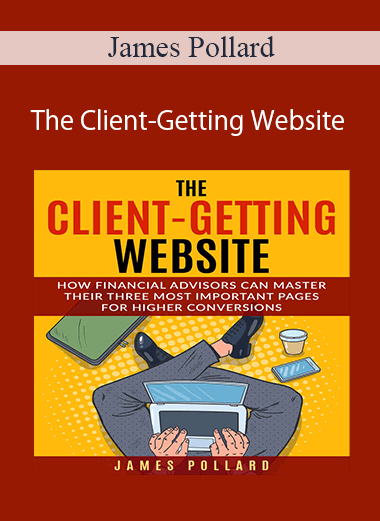
 James Pollard – The Client-Getting Website
If you’re a financial advisor who wants to double, triple, or even quadruple your website’s effectiveness, then here is a story about how my friend Chris did it…
…and why I believe you can do the same with your website.
Chris worked as a financial advisor in Delaware (my home state) and began talking to me about his website.
Long story short, it wasn’t performing as well as he thought it should. He knew his prospects were searching for him online. He could see people were visiting his site, but they weren’t turning into leads, prospects, or clients.
You see, Chris had a problem and…
It’s A Problem A Lot Of Financial Advisors Have…
They hit a wall and don’t know how to proceed.
If you’re a financial advisor with your own website, maybe you empathize with how Chris felt.
Frustrated.
Confused.
Disheartened.
Because while he had a website, he wanted to step it up a notch. He wanted to make sure his website was working as hard as he was. But try as he might, he couldn’t find a way to improve it.
Chris tried a bunch of stuff.
He articles and books.
He hired “tech-savvy” people to help him (including a $125 per hour freelancer).
He asked a few friends for advice.
Nothing worked.
Sure, he made a few incremental improvements here and there, but it wasn’t the progress he wanted.
Yet, despite all this, he knew there was a solution.
Chris Knew He Could Improve But Didn’t Know How…
He sent me an email one day, asking for advice.
He told me about how he tried a bunch of ways to improve it. He explained how he’d read books, studied websites, and hired people.
All he wanted was a way to leverage his website so it could get more clients for him. He wanted it to be a money-printing machine instead of a money-eating monster.
I listened and smiled because I knew I could fix his problem.
Here’s What I Did…
First, I went to his website.
It was classy. It looked great. It loaded fast, had a nice theme, and I could find information about him easily enough.
After reading that, you might think since Chris had a great-looking website, that it wasn’t the problem.
But you must understand…
A Great-Looking Website Does NOT Equal Effectiveness!
You know what’s funny?
Almost nobody knows this. Chris didn’t.
This means advisors hire fancy web designers to create good-looking websites. Then, they cross their fingers and hope it will impress prospects.
It never does.
I explained this to Chris, but he was still left with the question of…
“What Specific Things Can I Do To Improve My Website And Make It Convert Better?”
Here’s what I did for Chris…
I revealed to him the unfortunate truth that most website-related advice does NOT apply to financial advisors.
I also told him that there are three pages he needed to master if he wanted to get more clients with his website. They are:
1. The homepage…
2. The “about us” page, and…
3. The “contact” page.
I even outlined an action plan he could use to improve these pages with specific steps he could take to make his website more effective.
I sent it to him, hoping he would find it useful.
I Didn’t Hear From Chris For A Month…
I started to worry… thinking that he didn’t get it… when one day, he sends me an email and says:
“James! People are finally reaching out to me from my website!”
I smiled. What a wonderful feeling.
We emailed back and forth, and he told me what happened.
He implemented the changes I suggested and experienced an immediate lift in conversions. And because these changes worked so well for him (and hundreds of other advisors by now)…
I’ve decided to package them up into a 98-minute video training that you can access right away.
Keep reading…
But First, Read This Disclaimer…
Please understand that my results are not typical. I’m not implying you’ll duplicate them (or do anything for that matter).
The average person who buys any “how to” information gets little to no results. As with all of my products, my references are used for example purposes only.
I’ve had years of experience helping financial advisors get clients from their websites (and I’ve done hundreds of website reviews) and my personal results should be considered exceptional.
Your results will vary and depend on many factors… including but not limited to your background, experience, and work ethic.
All business entails risk as well as massive and consistent effort and action. If you’re not willing to accept that, please DO NOT GET THIS.
With that said…
Here’s The Exact System You Can Follow To Make Your Website Better…
This is a 98-minute video training titled:
“The Client-Getting Website: How Financial Advisors Can Master Their Three Most Important Pages For Higher Conversions”.
After going through this training, you will have a clear roadmap of what to do to make your website better. It is a useful framework with tools and resources to help everyone from beginner to expert.
The reason my approach works so well is because it focuses on RESPONSE. There are tons of books, videos, and services out there that will help make your website pretty, but they don’t give you much detail about how to turn a visitor into a client. That’s my specialty.
This is NOT about web design. It’s also NOT about fancy widgets, tools, and gadgets. This is about the psychology behind what causes a website visitor to convert into a booked appointment and/or paying client.
In these videos, I break down your website into manageable components. Then, I give detailed instructions for making it better.
Here’s a sneak-peek of what’s inside:
Video 1: Attracting Inbound Leads With Your Homepage
- How to get unlimited website traffic at no cost to you. (Most financial advisors don’t realize getting traffic is the easiest part of building an effective website, and I’ll show you why.)
- Three scientifically proven “grabbers” the world’s best websites use to direct attention.
- The biggest mistake financial advisors make on their homepages which ensure prospects almost never turn into clients. (I see this mistake made on upwards of 90% of financial advisor websites.)
- The “two-minute tweak” that can immediately generate more phone calls to your office. (This works especially well on mobile. So, if you receive a lot of traffic from mobile devices then you can get a LOT of calls.)
- The #1 most important element for building trust on your website. (According to a McAdam survey, 71% of Americans say they’re scared of talking to a financial advisor. Having this feature on your website can flip that statistic on its head for you.)
- My 5-step homepage enhancement process you can use to ensure your website visitors stick around and take your desired action.
- The 1960s “Mad Men” secret that allows my Inner Circle members to crush their competitors. (This tip is so important that I capitalized it, bolded it, and highlighted it to be sure you don’t miss it.)
- 7 things to include on your website to maximize your credibility so prospective clients take you seriously.
- One simple change – which takes less than five minutes to implement – that can boost your conversion rates as much as 104%. (A popular split-testing software conducted this test and received a 48% boost. An art gallery used it to more than double their conversions.)
Video 2: Building Rapport With Your “About” Page
- How to construct a rock-solid unique value proposition that your competitors cannot steal or duplicate.
- The correct way to use photos of yourself and your team. (Unfortunately, most financial advisors are incorrectly using the standard professional photos, which don’t help them stand out.)
- How to use a P.S. on your “about page” to skyrocket your inquiries. (The British Quality Foundation found that companies that used this technique had a 63% increase in operating income and a 39% growth in sales, and almost nobody does it.)
- The 6 exact things investors expect to see when reading a financial advisor’s “about us” page, ranked in order of importance.
A note about that last tip…
Most financial advisors don’t realize that studies have been done which outline – in precise detail – what investors want to see when researching financial advisors online.
That’s why my strategy for making “about us” pages work is refreshingly straightforward. It comes from legendary copywriter, Robert Collier. He sold more than $20 million worth of products through the mail using only his persuasive skills. He’s famous for this quote:
“Always enter the conversation already taking place in the customer’s mind.”
This is the biggest secret to an incredible “about us” page. Because if you can weave the six things prospects desire into your website, you will enter the conversation already taking place in their minds and you will be lightyears ahead of everyone else.
Video 3: Sealing The Deal With Your “Contact” Page
Most people believe a contact page is a place to submit a form and that’s it.
Nothing could be further from the truth.
If you think your contact page is merely a place for people to reach out to you or request more information, I GUARANTEE you’re leaving money on the table.
In this video, I reveal how financial advisors can generate more inbound leads by pushing people away from their contact page. It sounds counterintuitive, but it’s true and it works so well that I do it on my own website.
Not only that, but I reveal five of the biggest reasons why visitors don’t engage with financial advisors’ contact pages. Fortunately, the most significant reason is also the easiest to fix. It can be put right by adding one unassuming sentence to your contact page (two if you’re ambitious).
This means even if you get nothing else from this entire video training, this simple two-minute solution can pay for it in full.
As you can see, these videos contain a treasure trove of client-getting information. And that’s only the tip of the iceberg.
However, a warning…
These videos are not sexy or highly produced. I made three PowerPoint presentations with THE most important website marketing tips known to financial advisors, turned on my camera, hit record, and started talking. Which means if you’re the type of person who judges a book by its cover, these videos are NOT for you.
Proof Content
Sale Page: https://www.theadvisorcoach.com/website.html
Archive: https://archive.ph/wip/2348h
Delivery Method
– After your purchase, you’ll see a View your orders link which goes to the Downloads page. Here, you can download all the files associated with your order.
– Downloads are available once your payment is confirmed, we’ll also send you a download notification email separate from any transaction notification emails you receive from coursesblock.com.
– Since it is a digital copy, our suggestion is to download and save it to your hard drive. In case the link is broken for any reason, please contact us and we will resend the new download link.
– If you cannot find the download link, please don’t worry about that. We will update and notify you as soon as possible at 8:00 AM – 8:00 PM (UTC 8).
Thank You For Shopping With Us!


