Usability of Confirmation Email and Transactional Messages
74 Design Guidelines for Automated Messages from Websites to Customers
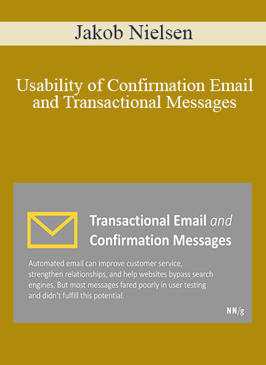
Confirmation email is one of the most important touchpoints for keeping customers appraised of the status of their transactions and for enhancing your reputation for great customer service. Good email usability can save huge amounts of money by reducing the number of telephone calls to your call center. Bad email will often get deleted unread; it’ll definitely make customers feel uncertain and poorly treated.
The report contains 74 guidelines for improving the design of confirmation email and other transactional messages that are generated automatically by a computer (the report doesn’t cover human-authored customer service email). The report is richly illustrated with 40 screenshots of many different email messages, showing usability problems we found in our testing as well as examples of highly-usable transactional email.
This report is based on empirical usability testing and shows what happens when real users interact with real email, starting with the inbox (where many messages get deleted ruthlessly), and continuing with the actual content of the message.
We observed a broad range of test users as they processed 40 transactional email messages. Most were confirmation emails, covering the following categories:
- Order and service confirmations
- Shipment notifications
- Reservation confirmations and e-tickets
- Available now notices
- Billing and payment notices
- Cancellations, returns, refunds, rebates, and bonuses
- Information request responses
- Government responses
- Customer service messages
- Failure notices
- Registration and account information
Table of Contents
110-page report.
- Executive Summary
- User Research
- Surviving Spam-Filled In-Boxes
- Avoid or Minimize Message Sequences
- Tell Users What They Want to Know
- Confirmation Email Builds Trust
- Study Overview
- How People Use and Manage Email
- How Email Affects Trust and Perceptions of Accuracy
- Incomplete Information
- Lack of Personal Information
- Lack of Company Information
- The Unavailable Company
- Unanswered Questions
- What Participants Said They Wanted: Prioritized list of 27 types of information
- Misunderstandings
- Questions About Practices or Policies
- Sales Pitches
- Hidden Charges
- Customer Service
- Privacy and Security
- Incomplete Information
- Guidelines List
- Email Guidelines and Discussion
- Email Components
- From: (Sender Information)
- Unhelpful From Lines: 8 that didn’t work
- Effective From Lines: 12 that worked well
- Subject: (Topic)
- Effective Subjects: 18 words and terms that worked well
- Ineffective Subjects: 10 words and terms that cause users to delete messages
- Other Kinds of Subject Problems
- To: (Recipient Information)
- The In-Box View
- Message Body
- Order
- Style
- Mistakes to Avoid
- Information
- Format
- Order Confirmations
- Shipping Confirmations
- Cancellations and Refunds
- Downloads
- Reservation Confirmations and e-Tickets
- Message Sequences
- Dealing with Important Customer Concerns
- Giving and Getting Information
- Personal Information
- Company Information
- Answering Questions
- Being Available
- Give People What They Want
- Preventing Misunderstandings
- Improving Practices and Policies
- Preaching to the Choir
- Repeat Key Information
- Customers Love Service
- Making People Feel Safer
- Giving and Getting Information
- Anatomy of the Successful Message
- Measuring Message Success
- Recommended Features by Type of Message
- Agreement Change Notices
- Available Now Notices
- Billing and Payment Notices, Cancellations, Returns, Refunds, Rebates, and Bonuses
- Customer Service Messages
- Failure Notices
- Government Responses
- Information Request Responses
- Order and Service Confirmations
- Shipment Notifications
- Registration and Account Information
- Reservation Confirmations and E-tickets
- Status Notifications
- Profile Update Notifications
- Methodology
- How the Study was Conducted
- Participants
- Test Tasks
- Considerations When Planning Your Own Email Studies
- Email headers
- Dates
- Offensive messages
- Recipient
- Data capture and note taking
- What to test in email messages
What You Get
- Checklist of 74 specific design recommendations: review your email design for these 74 items, and you will discover several things that need improvement.
- The average website typically violates about half of our usability guidelines. You might have the one perfect site in the world that does everything right, but the odds are against you. It is safest to score your design against a checklist of usability guidelines to make sure you don’t do anything wrong.
- Description of how users behave when using a wide variety of email messages, including extensive quotes (often colorful, because they were often annoyed). Learn from the users’ comments and reactions to common design mistakes we tested.
- 40 screenshots of transactional emails with descriptions of why they worked well for users or caused them problems in usability testing.
- Inbox view of 60 emails with data showing how many users would save or open each message (the 40 transactional messages we tested plus 20 regular emails included for context)
- $40,000 of user research at 0.3% of the cost.
- Test methodology description, allowing you to run your own user tests of your own emails.
Who Should Read This Report?
This report has important information for:
- Anybody who is responsible for the design of automated email messages.
- Executives in charge of Internet communications strategy or online customer service
Get Download Jakob Nielsen – Usability of Confirmation Email and Transactional Messages at coursesblock.com right now!
Delivery Method
– After your purchase, you’ll see a View your orders link which goes to the Downloads page. Here, you can download all the files associated with your order.
– Downloads are available once your payment is confirmed, we’ll also send you a download notification email separate from any transaction notification emails you receive from coursesblock.com.
– Since it is a digital copy, our suggestion is to download and save it to your hard drive. In case the link is broken for any reason, please contact us and we will resend the new download link.
– If you cannot find the download link, please don’t worry about that. We will update and notify you as soon as possible at 8:00 AM – 8:00 PM (UTC 8).
Thank You For Shopping With Us!


